
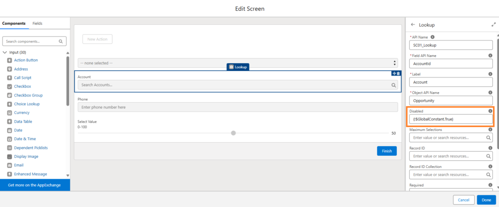
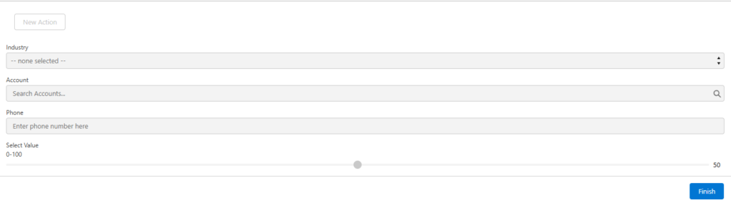
Action Button, Dependent Picklist, Lookup, Phone, and Slider screen components can now be disabled at run time using the component’s Disabled attribute. Setting component’s Disabled attribute to true will block screen flow users from focusing on or modifying any fields in the component. A gray background will appear on the component’s input fields to give users a visual cue
